Never Ever Do This in a Choropleth Map!
A choropleth map is a great tool to show data in a thematic way, using shaded or patterned areas in proportion to a statistical variable. A typical choropleth map might look like this.

From the map, we can easily tell that during that period, Nevada and California had relatively higher unemployment rates. I’m not sure what happened to Vegas and Silicon Valley, but I could tell there was something going on in the western states.
A single-hue progression is used in it to map the magnitude. When it comes to values changing from negative to positive, bi-polar progressions could be applied. Appropriate color progression selection is necessary in a map. Color selection is truly an important and huge topic to discuss while making a choropleth map (not to mention classification methods).
Normalization
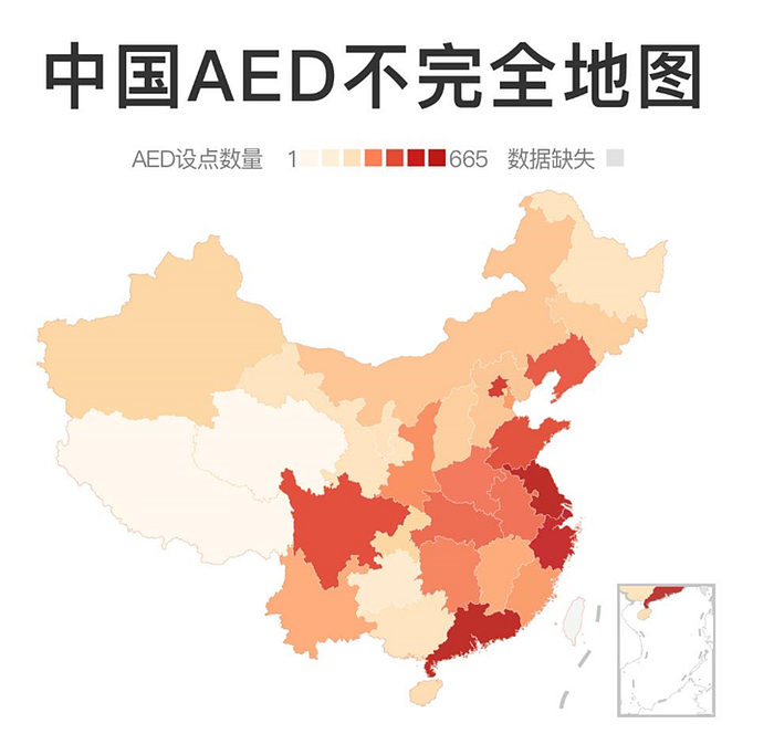
My biggest pet peeve in choropleth maps has nothing to do with the colors — it is about the values. Without further ado, let’s look at this map below.

The common error of choropleth maps happening here is about normalization. In choropleth map, it is always important to keep in mind that never ever use raw data values to represent magnitude. A better and recommended way is to use normalized values to produce a map of densities.
To do some translation, this map represents the number of AEDs (Automated External Defibrillators) by provinces in China. Instead of using the normalized data, the producer used the exact numbers of AED collected from online maps.
The reason to normalize the data is that the eye naturally integrates over areas of the same color, having a tendency to undue prominence to larger polygons with moderate magnitudes and minimizing the significance of smaller polygons with high magnitudes. To solve this issue, we can simply normalize the variable by dividing it by the total area or population, making the derived density, which is a new field.
My Attempt
Since I am a Taiwanese, and I could not access the data source of the map above, I tried to use the open data of AEDs on Integrated Platform for Government Open Data of the Government of Taiwan. By grouping the values by cities and counties and normalizing the data by dividing it by the population, a choropleth map of AED Densities is then generated.

The result of the mapping is actually quite surprising. Since interpreting this map is not the main topic of the article, I will explain it later with another article next time.
After all, never ever forget to normalize your data when making a choropleth map. Happy mapping!
My name is Glenn Kong. You can find me on Medium or LinkedIn.
For more Geospatial content, follow G for Geospatial — 台灣空間資訊站.
